Sunday, December 21, 2014
Thursday, December 18, 2014
[ ◕ ◡ ◕ ] newspaper club questions + answers
Questions asked:
1. What key principles/ideas represent the Newspaper Club?
2. What are the club's main goals/purpose?
3. What are five words that describe the club the most?
4. When was the Newspaper Club established and how?
5. What are/were some of the hardships and successes of Newspaper?
6. What colors would represent Newspaper?
Established in 2003, the goal of the Millennium High School Newspaper Club is to not only provide credible information to the student body, but also to spread equal awareness of certain topics through reliable reporting. Members of the Newspaper Club are characterized as dedicated, passionate, driven, curious, and scholarly. A challenge the Club faced before was trying to recover immediately after Superstorm Sandy hit New York City two years ago. However, reoccurring challenges the Newspaper Club faces are finding students who are willing to work outside of class, maintaining a core staff, and completing the newspaper layouts. The Club aims to publish monthly issues and contributing articles to each issue, especially at the beginning of each year, seems difficult due to the "beginning of the year" jitters and all. However, the Newspaper Club has always ended up being successful. Lastly, the colors that would most represent Newspaper and portray school spirit are red, black, and white.
Monday, December 15, 2014
[ ⊙△⊙ ] favorite logos
One of my favorite logos is from Apple. I really like the simplicity of it and how it's easily recognizable. The silverish colors used, in addition to the glass theme, creates a metallic effect. This not only matches the company's purpose of making new technological advancements, but also helps makes Apple and Apple's products very iconic and authentic.
A logo I think is really well-designed is Antartica. This logo simply features a penguin, which is an iconic animal that lives in Antartica. Not only that, but the shape and design of the penguin creates an "a" that matches logo's font. The logo also only has two colors: dark grey/black and white. This brings contrast in the design and catches attention easily.
Monday, December 8, 2014
[ ⊙ ω ⊙ ] portrait transformation
Before:
After:
Process:
First, I took various photos of my sister and selected one where she was making one of her "derpy" faces. I wanted to incorporate penguins into the transformation (since they're so cute and fluffy) and decided that my concept would be about the interaction between a normal penguin and a huguin (human + penguin). I used Photoshop to manipulate the two images, using image adjustments such as color balance and selective color, cropping and erasing, and then liquifying my sister's hair so that it would look more realistic. Lastly, I placed my sister's head onto the penguin on the right.
This transformation turned out better than I pictured it to be since I was able to liquify her hair instead of just letting the hair look a bit faded like it originally did. Also, with suggestions from peers I removed the collar of her shirt so that the penguin neck would show through.
All in all, I like the result of the image since it shows the personality of my sister really clearly.
Tuesday, November 18, 2014
[ o(╥﹏╥)o ] symbol.gif + project reflection
The most frustrating aspect of the project was actually trying to come up with a simple, but powerful symbol for the idea of a home. I was aware that having a home didn't necessarily mean having a physical house, but it was such a challenge to replace the window (which resembles a house) with something even stronger and effective. Because of this, I had to go back to my original sketch for the symbol, even though it slightly bugged me.
After completing the project, which tools do you feel most confident using?
My level of confidence with all the tools I had to use for this project fairly stayed the same since I self-taught myself the program during freshman year. However, if I really had to pick one, I would say the marquee tool. This is because I learned about the different types of selection you can make on a layer (ie. adding/subtracting something to/from your selection). I never noticed this detail before.
Which tool do you wish you were better at using? Explain why.
I didn't use this tool for this project, but I wish I was better at using the gradient tool. I have very little experience with gradients in Photoshop since I never had to use them, so I would like to learn more about it and learn how to make really subtle gradients. Also, when I do want to use the tool, it slightly intimidates me for some unknown reason.
What would you like to create next on Photoshop?
I would like to create book covers or even website layouts! I've never done those before, so it'd be nice to have some idea of how to do either of these things (in addition to having a rubric so that you can know what you need to improve on).
Friday, October 24, 2014
[ ◕‿◕✿ ] GIF
Monday, October 20, 2014
[ ⊙ o ⊙ ] David Carson Concept Board
How has __________ impacted the graphic design world?
David Carson, an American graphic designer, surfer, and art director, has impacted the graphic design world because he was known to be the one who broke all the “rules” of design through the use of grunge typography. Grunge typography is essentially fonts that are not clean and simple, but rather chaotic and have messy lines. This type of font is made well-known through the Ray Gun Effect (Ray Gun is the magazine that Carson first designed for). With grunge typography, Carson arranged letters in a way that the words were almost illegible as a way to express emotions and concepts. Despite having such a lasting influence on the design world today, Carson was initially a surfer who graduated from San Diego University with a Bachelor’s Degree in Sociology. His first contact with the graphic design world was in the University of Arizona in 1980, however, Hans Rudolf Lutz was the man who had the first great influence on his design work in 1983.
When he finally received his degree in graphic design, Carson began to work with the magazine Transworld Skateboarding in 1984 and Transworld Snowboarding in 1987. The first significant impact Carson had in graphic design was when he was asked to create issue covers for Beach Culture, in which he used unique ways to communicate ideas to readers, such as covering two pages with black for a feature of a blind surfer. Carson was then asked to create covers for Ray Gun, where he used type that was uncommonly seen, such as Dingbat. Through these methods of using type and out-of-the-box approaches, Carson made his own name well-known. From then on, Carson began to work with clients such as AT&T, Pepsi Cola, Ray Ban, NBC, Apple, Microsoft, etc.References:
http://en.wikipedia.org/wiki/David_Carson_(graphic_designer)
http://www.davidcarsondesign.com/
http://www.aiga.org/medalist-david-carson/
http://www.designishistory.com/1980/david-carson/
http://www.davidcarsondesign.com/
http://www.aiga.org/medalist-david-carson/
http://www.designishistory.com/1980/david-carson/
http://www.theawl.com/2012/08/grunge-typography
http://www.theverge.com/2013/12/27/5247944/the-awl-history-of-grunge-typography
http://www.theverge.com/2013/12/27/5247944/the-awl-history-of-grunge-typography
Monday, October 6, 2014
[ ◕ ◡ ◕ ] an example of good graphic design
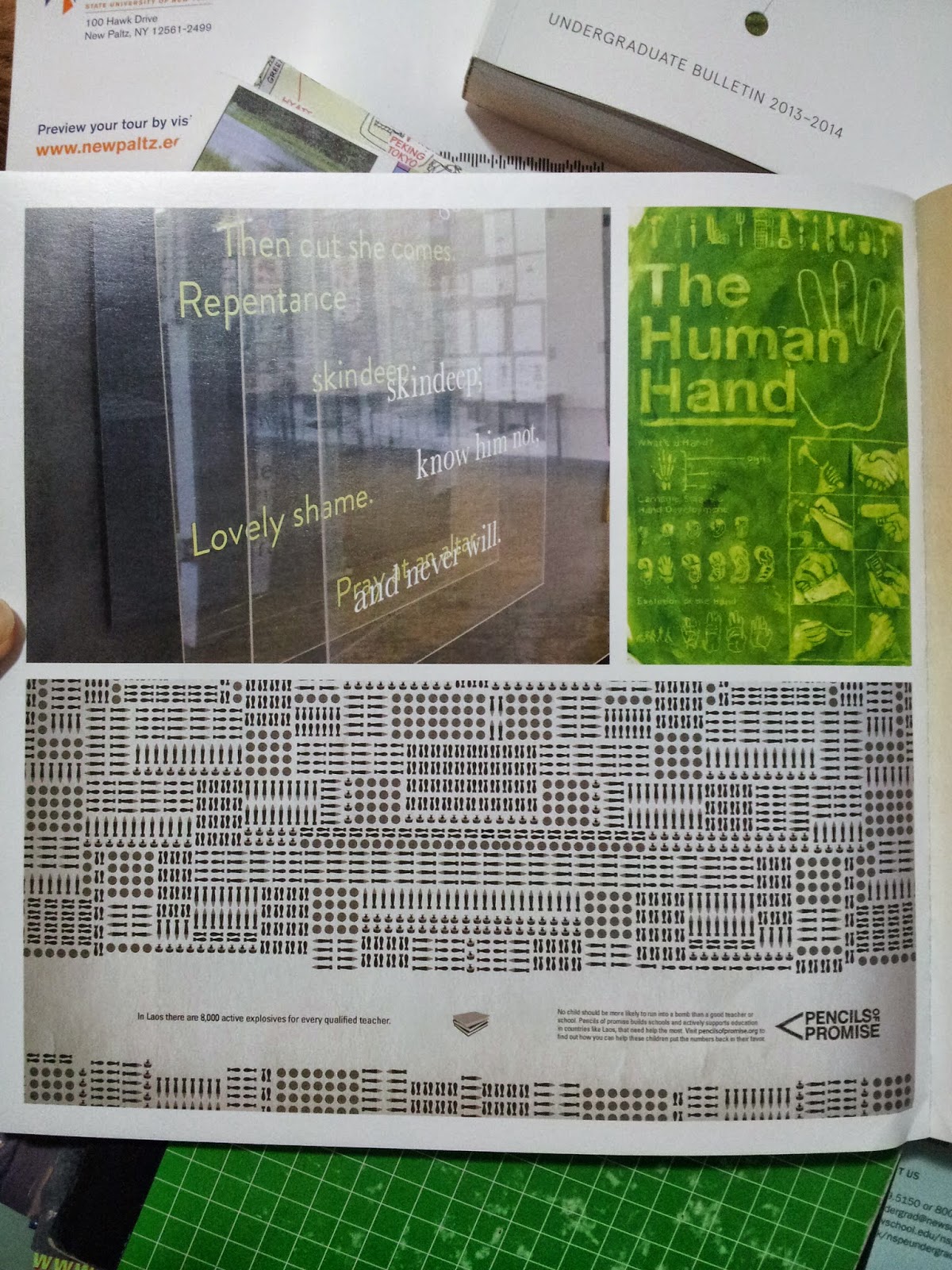
I cannot begin to express how much I love the designer who created the Undergraduate Bulletin for 2013-2014 and 2014-2015. I love the simplicity in the first Pencils of Promise ad and how that simplicity is able to express such a meaningful idea. Something else I really love is the way everything is executed so simply, but also is still able to convey a strong message to the viewers. For example, in first Pencils of Promise ads, it is honestly so easy to recreate and probably isn't that time-consuming, but it's so clean and nice and has such a strong idea behind it. I love the fact that a pencil tip was used to represent a mountain, which can sort of represents goals (especially for those who are interested in mountain climbing, the top of the mountain is the destination and goal). What I also really like is that the designer's choice of using a pencil completely enhances the concept of the campaign Pencils of Promise. In addition, the type goes with the design a lot since the designer used a mountain as a symbol of something that is hard to reach, but is still possible to conquer at the same time.
In the second ad, the one about Laos, there's so much detail to emphasize the amount of danger in the daily lives of children through the different types of bombs that are shown. Also, can we take the time to admire the logo for Pencils of Promise???
In the second ad, the one about Laos, there's so much detail to emphasize the amount of danger in the daily lives of children through the different types of bombs that are shown. Also, can we take the time to admire the logo for Pencils of Promise???
 |
| One of the many works displayed in the Pratt Undergraduate Bulletin. This one is for some- thing called Pencils of Promise. |
 |
| Another ad for Pencils of Promise. |
 |
| I couldn't rotate the photo on Blogger, but the text reads, "No child should be more likely to run into a bomb than a good teacher or school. Pencils of promise builds schools and actively supports education in countries like Laos, that need help the most. Visit pencilsofpromise.org to find out how you can help these children put the numbers back in their favor. |
Thursday, October 2, 2014
[ ◕ o ◕ ] my inspiration
It's actually hard for me to pinpoint specific things that inspire me. For one, I'm so open to everything that even the most random things, such as the angle and lighting of how a cup is placed on the table or cute cat pictures (yes, i'm so serious about this) can inspire me to create art. But when we're talking about things that inspire me as an individual, I believe that the people around me are the ones who continuously motivate me.
There are actually two people in the entire world who have the greatest influence on me: my best friend Jenny and my boyfriend Cheok.
I've known Jenny since fourth grade, but we only became closer during freshman year when we both needed someone to rely on. She's crazy and weird, but she never fails to make me laugh and introduce me to new things. I guess people might (maybe) think she's into the weirdest stuff, but the fact that she's always standing by her beliefs is so inspiring. She's not afraid to be true to herself and ultimately, she doesn't let anyone bring her down. Jenny also seriously never ceases to amaze me with her art (ESPECIALLY WITH HER CODING MHM MHM) and is someone I constantly learn from.
As for Cheok, he plays two roles in my life (the boyfriend and best friend). The one thing about him that inspires and motivates me is how strong he is emotionally. Even when he's going through hard times in his life, he still tries to cheer me up and constantly encourages me, knowing that I can achieve a lot of my own goals and goals set by other people. Cheok is also street-smart, not just book-smart, and that makes me want to better myself even more. In fact, everything about him is motivation for me in life because he has all the qualities I lack.
tldr; My best friend Jenny and my boyfriend Cheok are the two people who inspire me the most in my life.
There are actually two people in the entire world who have the greatest influence on me: my best friend Jenny and my boyfriend Cheok.
 |
| Jenny (credits: basedkuroko) |
 |
| Me and Cheok (credits: Cheok) |
tldr; My best friend Jenny and my boyfriend Cheok are the two people who inspire me the most in my life.
Monday, September 29, 2014
[ ⊙ △ ⊙ ] letter project reflection
- Describe your process when creating your letter project. How was the process helpful or not so helpful to you?
When creating my letter project, I first began to sketch out 25 thumbnails for ideas. Despite not having so much detail, I was able to map out so many concepts. This gave me a lot of ideas to choose from. After the sketches, I chose two designs (a banana arrangement and a simplified skittles arrangement) and created initial drafts for each them. Usually, this step would be the most helpful to me in creating a design, however, I wanted to photograph it so any experimentation would have to be done in real time, not on paper. I then decided to use Skittles as my media and bought about $10 worth of Skittles so that I would have more colors to choose from and more Skittles to use (also more to snack on, but nobody has to know). Taping four sheets of white copy paper together and drawing a backwards S on the back, I arranged my Skittles into a rainbow-like display and then photographed it. This was the most crucial part of my project since the arrangements affected the outcome of the project directly. It was also the most helpful since I was able to alter my designs as much as I wanted. Lastly, I had to edit the picture of my letter on the computer in order to clean it up and bit and make it more presentable. - How did you arrive with your concept/idea for your letter? How did you represent this concept visually in your design? (Give 2 examples)
I originally chose the letter S since I loved how there were so many curves in it. It was basically one of the more non-boring letters to me. On the other hand, the Skittles concept I decided to go with was pretty much random since I thought of animals, words or food that started with S. Instead of just photographing a random arrangement of Skittles in an S shape, I wanted to clearly illustrate the slogan of Skittles, which was "Taste the rainbow." To do this, I created a rainbow pattern with the Skittles in the shape of an S and reversed it at the bottom as well in order to emphasize more on the rainbow aspect. Not only that, I also tried to represent the Skittles concept by creating a Skittles cloud with the same colors because usually, rainbows are visualized as peeking through clouds in the sky. - What was the most challenging aspect of this project for you? Why?
The most challenging part of this project was thinking of more ways that would clearly show my concept towards my audience. At first, I had a different idea, but I had to change it since I couldn't come up with a more effective way to depict the concept. I settled with the Skittles idea after choosing a more simpler idea, however, I still wanted to challenge myself to take the project further. And because most of the trial-and error had to be done in person instead of on paper, I had to change my arrangements several times in order to portray my idea clearly. - Are you satisfied with your project? Explain your answer.
Despite its simplicity, I'm actually satisfied with my project because I spent so much time brainstorming ideas and ways to convey my ideas in addition to actually arranging the Skittles themselves. I really liked the amount of color there was and I liked being able to create art on a medium I've never explored before. This exploration into unknown territory gave me the most satisfaction. - If you can change anything about your design, what would you change or do differently?
Instead of arranging the Skittles into an S, I would create a rainbow-flavored Skittle with a S-shaped empty space in the middle so that it could potentially emphasize the Skittles aspect even more. I would also play with different sizes for the Skittle in order to put incorporate detail in the design.
Work in Progress + Final:
 |
| First Arrangement |
 |
| Second Arrangement |
 |
| Third Arrangement |
 |
| Final Arrangement |
Thursday, September 11, 2014
[ ◕ ◡ ◕ ] a super duper short bio
Name: Sky Wan
Grade: 12
Interests:
✐ food
✐ art (mainly fine arts + graphic design)
✐ kpop
✐ gaming
✐ technology
✐ coding (beginner)
✐ sewing (still a beginner)
✐ peach hi-chew
✐ making cursors
✐learning new languages
Languages: English, Mandarin, Cantonese, a bit of Japanese and Korean
Height: Tall enough to be seen
Funny story: This is actually really gross, but when I went to visit Binghamton over the summer, I needed to barf my guts out (after eating brunch from iHOP) literally a second before the students were split into their student tour groups. Lesson learned: My stomach dislikes iHOP very much.
Last dinner: 7:30PM today (09/11/14)
Best lunches near MHS:
★★★★ aubon
★★★ chipotle
★★★★ subway
★★★ yips
Subscribe to:
Comments (Atom)


