Monday, October 6, 2014

[ ◕ ◡ ◕ ] an example of good graphic design

I cannot begin to express how much I love the designer who created the Undergraduate Bulletin for 2013-2014 and 2014-2015.  I love the simplicity in the first Pencils of Promise ad and how that simplicity is able to express such a meaningful idea.  Something else I really love is the way everything is executed so simply, but also is still able to convey a strong message to the viewers.  For example, in first Pencils of Promise ads, it is honestly so easy to recreate and probably isn't that time-consuming, but it's so clean and nice and has such a strong idea behind it.  I love the fact that a pencil tip was used to represent a mountain, which can sort of represents goals (especially for those who are interested in mountain climbing, the top of the mountain is the destination and goal).  What I also really like is that the designer's choice of using a pencil completely enhances the concept of the campaign Pencils of Promise.  In addition, the type goes with the design a lot since the designer used a mountain as a symbol of something that is hard to reach, but is still possible to conquer at the same time.

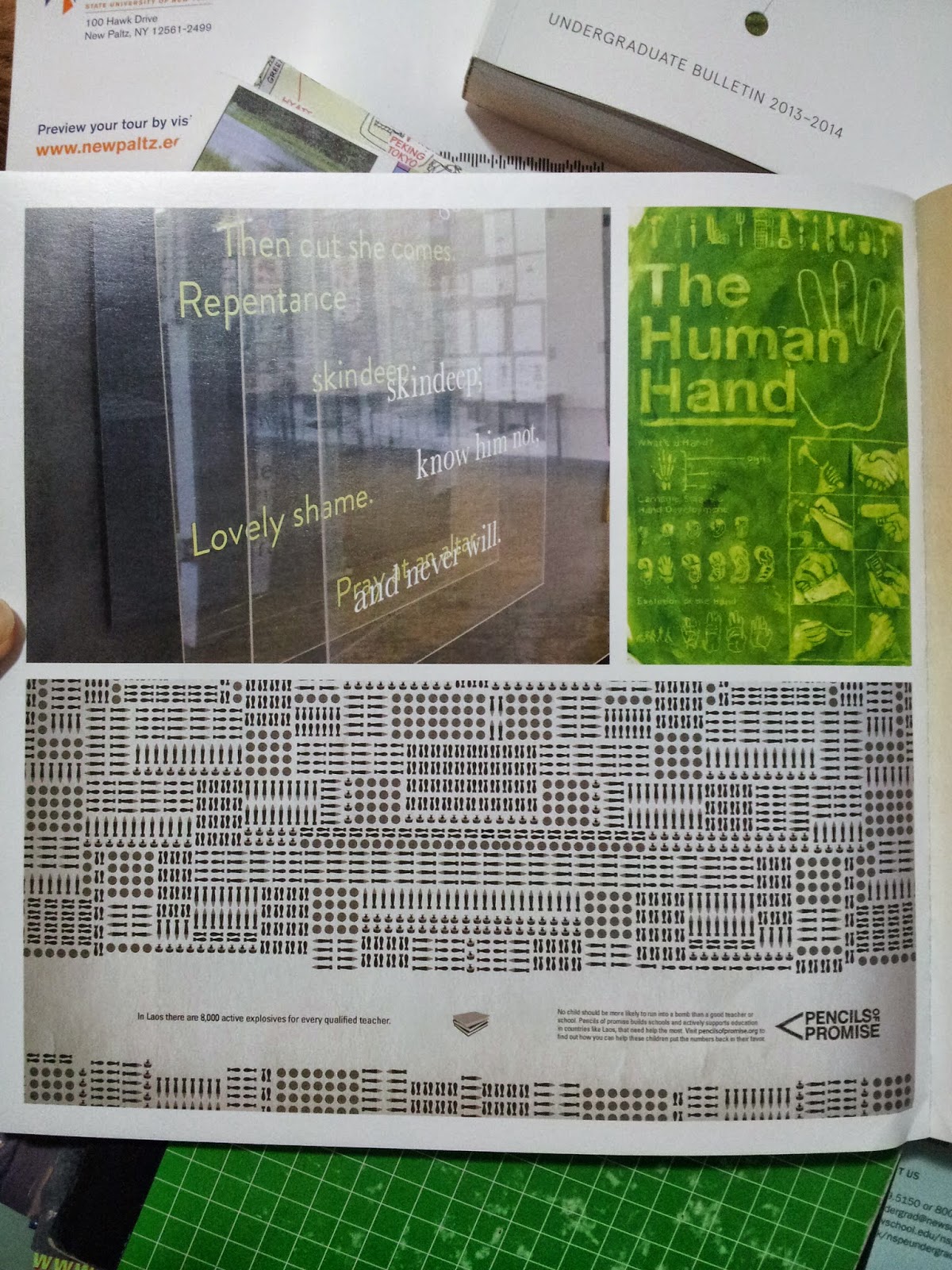
In the second ad, the one about Laos, there's so much detail to emphasize the amount of danger in the daily lives of children through the different types of bombs that are shown.  Also, can we take the time to admire the logo for Pencils of Promise???


One of the many works displayed in the Pratt
Undergraduate Bulletin. This one is for some-
thing called Pencils of Promise.
Another ad for Pencils of Promise.


I couldn't rotate the photo on Blogger, but the
text reads, "No child should be more likely to
run into a bomb than a good teacher or school.
Pencils of promise builds schools and actively
supports education in countries like Laos, that
need help the most. Visit pencilsofpromise.org
to find out how you can help these children put
the numbers back in their favor.

No comments:

Post a Comment