Sunday, December 21, 2014
Thursday, December 18, 2014
[ ◕ ◡ ◕ ] newspaper club questions + answers
Questions asked:
1. What key principles/ideas represent the Newspaper Club?
2. What are the club's main goals/purpose?
3. What are five words that describe the club the most?
4. When was the Newspaper Club established and how?
5. What are/were some of the hardships and successes of Newspaper?
6. What colors would represent Newspaper?
Established in 2003, the goal of the Millennium High School Newspaper Club is to not only provide credible information to the student body, but also to spread equal awareness of certain topics through reliable reporting. Members of the Newspaper Club are characterized as dedicated, passionate, driven, curious, and scholarly. A challenge the Club faced before was trying to recover immediately after Superstorm Sandy hit New York City two years ago. However, reoccurring challenges the Newspaper Club faces are finding students who are willing to work outside of class, maintaining a core staff, and completing the newspaper layouts. The Club aims to publish monthly issues and contributing articles to each issue, especially at the beginning of each year, seems difficult due to the "beginning of the year" jitters and all. However, the Newspaper Club has always ended up being successful. Lastly, the colors that would most represent Newspaper and portray school spirit are red, black, and white.
Monday, December 15, 2014
[ ⊙△⊙ ] favorite logos
One of my favorite logos is from Apple. I really like the simplicity of it and how it's easily recognizable. The silverish colors used, in addition to the glass theme, creates a metallic effect. This not only matches the company's purpose of making new technological advancements, but also helps makes Apple and Apple's products very iconic and authentic.
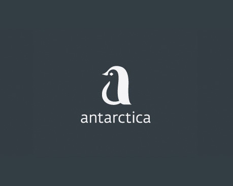
A logo I think is really well-designed is Antartica. This logo simply features a penguin, which is an iconic animal that lives in Antartica. Not only that, but the shape and design of the penguin creates an "a" that matches logo's font. The logo also only has two colors: dark grey/black and white. This brings contrast in the design and catches attention easily.
Monday, December 8, 2014
[ ⊙ ω ⊙ ] portrait transformation
Before:
After:
Process:
First, I took various photos of my sister and selected one where she was making one of her "derpy" faces. I wanted to incorporate penguins into the transformation (since they're so cute and fluffy) and decided that my concept would be about the interaction between a normal penguin and a huguin (human + penguin). I used Photoshop to manipulate the two images, using image adjustments such as color balance and selective color, cropping and erasing, and then liquifying my sister's hair so that it would look more realistic. Lastly, I placed my sister's head onto the penguin on the right.
This transformation turned out better than I pictured it to be since I was able to liquify her hair instead of just letting the hair look a bit faded like it originally did. Also, with suggestions from peers I removed the collar of her shirt so that the penguin neck would show through.
All in all, I like the result of the image since it shows the personality of my sister really clearly.
Subscribe to:
Comments (Atom)


