Friday, October 24, 2014

[ ◕‿◕✿ ] GIF

Sobs at first half of senior year.

Note: This gif has been hand-drawn entirely by me.  Do not attempt to steal or edit without permission.


Monday, October 20, 2014

[ ⊙ o ⊙ ] David Carson Concept Board


How has __________ impacted the graphic design world?


David Carson, an American graphic designer, surfer, and art director, has impacted the graphic design world because he was known to be the one who broke all the “rules” of design through the use of grunge typography.  Grunge typography is essentially fonts that are not clean and simple, but rather chaotic and have messy lines.  This type of font is made well-known through the Ray Gun Effect (Ray Gun is the magazine that Carson first designed for).  With grunge typography, Carson arranged letters in a way that the words were almost illegible as a way to express emotions and concepts.  Despite having such a lasting influence on the design world today, Carson was initially a surfer who graduated from San Diego University with a Bachelor’s Degree in Sociology.  His first contact with the graphic design world was in the University of Arizona in 1980, however, Hans Rudolf Lutz was the man who had the first great influence on his design work in 1983.

When he finally received his degree in graphic design, Carson began to work with the magazine Transworld Skateboarding in 1984 and Transworld Snowboarding in 1987.  The first significant impact Carson had in graphic design was when he was asked to create issue covers for Beach Culture, in which he used unique ways to communicate ideas to readers, such as covering two pages with black for a feature of a blind surfer.  Carson was then asked to create covers for Ray Gun, where he used type that was uncommonly seen, such as Dingbat.  Through these methods of using type and out-of-the-box approaches, Carson made his own name well-known.  From then on, Carson began to work with clients such as AT&T, Pepsi Cola, Ray Ban, NBC, Apple, Microsoft, etc.

References:


Monday, October 6, 2014

[ ◕ ◡ ◕ ] an example of good graphic design

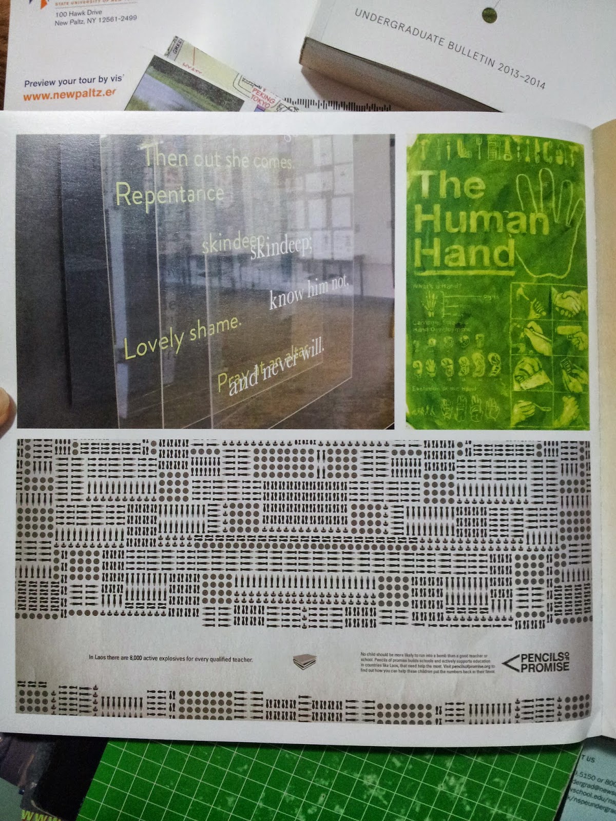
I cannot begin to express how much I love the designer who created the Undergraduate Bulletin for 2013-2014 and 2014-2015.  I love the simplicity in the first Pencils of Promise ad and how that simplicity is able to express such a meaningful idea.  Something else I really love is the way everything is executed so simply, but also is still able to convey a strong message to the viewers.  For example, in first Pencils of Promise ads, it is honestly so easy to recreate and probably isn't that time-consuming, but it's so clean and nice and has such a strong idea behind it.  I love the fact that a pencil tip was used to represent a mountain, which can sort of represents goals (especially for those who are interested in mountain climbing, the top of the mountain is the destination and goal).  What I also really like is that the designer's choice of using a pencil completely enhances the concept of the campaign Pencils of Promise.  In addition, the type goes with the design a lot since the designer used a mountain as a symbol of something that is hard to reach, but is still possible to conquer at the same time.

In the second ad, the one about Laos, there's so much detail to emphasize the amount of danger in the daily lives of children through the different types of bombs that are shown.  Also, can we take the time to admire the logo for Pencils of Promise???


One of the many works displayed in the Pratt
Undergraduate Bulletin. This one is for some-
thing called Pencils of Promise.
Another ad for Pencils of Promise.


I couldn't rotate the photo on Blogger, but the
text reads, "No child should be more likely to
run into a bomb than a good teacher or school.
Pencils of promise builds schools and actively
supports education in countries like Laos, that
need help the most. Visit pencilsofpromise.org
to find out how you can help these children put
the numbers back in their favor.

Thursday, October 2, 2014

[ ◕ o ◕ ] my inspiration

It's actually hard for me to pinpoint specific things that inspire me.  For one, I'm so open to everything that even the most random things, such as the angle and lighting of how a cup is placed on the table or cute cat pictures (yes, i'm so serious about this) can inspire me to create art.  But when we're talking about things that inspire me as an individual, I believe that the people around me are the ones who continuously motivate me.

There are actually two people in the entire world who have the greatest influence on me: my best friend Jenny and my boyfriend Cheok.


Jenny (credits: basedkuroko)
I've known Jenny since fourth grade, but we only became closer during freshman year when we both needed someone to rely on.  She's crazy and weird, but she never fails to make me laugh and introduce me to new things.  I guess people might (maybe) think she's into the weirdest stuff, but the fact that she's always standing by her beliefs is so inspiring.  She's not afraid to be true to herself and ultimately, she doesn't let anyone bring her down.  Jenny also seriously never ceases to amaze me with her art (ESPECIALLY WITH HER CODING MHM MHM) and is someone I constantly learn from.


Me and Cheok (credits: Cheok)
As for Cheok, he plays two roles in my life (the boyfriend and best friend).  The one thing about him that inspires and motivates me is how strong he is emotionally.  Even when he's going through hard times in his life, he still tries to cheer me up and constantly encourages me, knowing that I can achieve a lot of my own goals and goals set by other people.  Cheok is also street-smart, not just book-smart, and that makes me want to better myself even more.  In fact, everything about him is motivation for me in life because he has all the qualities I lack.


tldr; My best friend Jenny and my boyfriend Cheok are the two people who inspire me the most in my life.